Perfect Properties
About the Project
Perfect Properties is a responsive web app designed for users looking to add to their property portfolio, or who want to find out more about a property of interest.
This project was developed as part of the UI for UX Design Certification Course through CareerFoundry.
I was responsible for the wireframes, prototypes, visual design, and guidelines/branding.
Role
UI Design
Tools
Sketch
Balsamiq
Adobe Illustrator
Adobe Photoshop
Invision
Mockuuups Studio
Prism
Pen & Paper
Our User: Rashida
“I want to provide my family with financial security. I’ve been considering buying property for a while, and am looking for a tool that can help me find what I’m looking for, quickly!”
About:
Rashida is an IT consultant in a quickly growing tech company who is new to real estate. She is always on the go, relies heavily on virtual meetings, and is great at multitasking. She is very comfortable with technology, and likes to rapidly sort through information.
In her free time, Rashida spends the weekends with her family in the countryside, and enjoys hiking and softball. She also enjoys researching the latest tech trends to help enhance her expertise.
Goals:
Rashida needs a way to search for reliable and uncomplicated information about possible property investments.
She wants to be able to know as much information about the property before contacting an agent to visit the site.
Rashida received a significant salary increase, and wants to purchase properties outside of the city to help solidify her financial security.
She needs to information to be quick, accurate, and to-the-point.
Sitemap
With an understanding of Rashida’s needs as a user, our first task was to create a sitemap to better understand how Rashida will navigate the app.
Wireframes
Using the sitemap as a guide, we need to translate this information into a usable app through wireframes and user testing.
Initial user feedback showed us that users are looking for ways to gather more information throughout their search. We refined the wireframes based on this information.
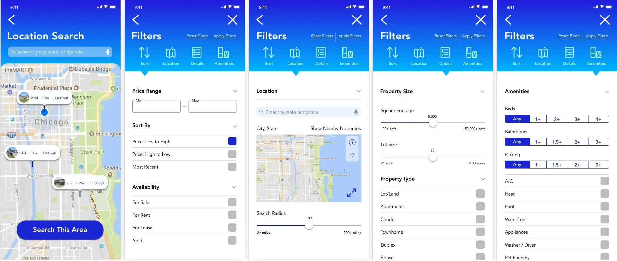
One of the most important aspects of the app is the Filter feature. We wanted to make sure that this is easy to navigate, and is organized and intuitive.
We also wanted to focus on refining individual property views, so that users will be able to access all of the information associated with the property and its surrounding area.
Mood Boards
Mood Board 1: Blues and purples, bold color, trendy gradients, gender neutral, cool/trendy mood.
Mood Board 2: Neutral greens, soft gradients, quiet/relaxed mood.
Two mood boards were developed to establish the color direction for this app. Mood Board 1 was ultimately selected because it conveys clean, quick, and smart. The colors used in Mood Board 1 follow some of the latest color trends and design applications in tech and product design. Blues and purples are among the top colors for the world’s most popular colors in 2020. Blues also tend to be less gender-specific than other colors, so the UI will feel more universal for users.
Refined Wireframes and Mockups
One of the most challenging parts of this project was incorporating color without having it overwhelm the imagery or app features. Ultimately, we wanted the colors to convey a modern feel without being distracting. Once color was applied to the mockups, we focused on finalizing the custom app icons, gestures, style guide, and prototype.
Custom icons designed for Perfect Properties
Example of gestures.


